


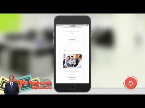


Hey everybody! Welcome back to another episode of “Winning with SEO” here on ReboReports. Today we’re continuing our series of these screen capture, your show you specific kind of things to help improve your website. Steps you can take the things you can look at it. Today we’re going to talk about responsive website design and simply put responsive website design is your website adapts and shows up properly on desktops, laptops, tablets and phones. Whatever size of screen is your website shows up ok and it’s important for two reasons. First off their stats out there that say that Mobile Browsing, people looking on tablets and phones. Pass desktop users people working on their laptop or their computer passed it in 2014 for people looking at websites and which devices right. So you wanna show for those people, you want your site to look good. Your site going to show up but does it look ok? can they read things? are the the fonts tiny, the pictures block in the way? Does it just get weird? Then secondly and and maybe more important for your industry is, Google has started to penalize people that don’t have a mobile friendly responsive website and when I say penalize it’s not that they’re blocking you from showing up on Google and your site’s never gonna get seen. Again it’s when people search on a mobile device. If your site is not mobile friendly, they’re gonna give preference to your competitor that has a mobile-friendly websites. Really critical that your site is responsive. So today I want to cover that and you can show you what a responsible website looks like. I’m gonna show you a site that we built at ACU WEB. And you know it’s a good look site. You got basic information that would be great, this is on a laptop. And then if we start to resize it and play with it, you’ll see that the information shifts around. Logos behind a little bit but this is what it’s looking like. See there’s a tablet and now the information there in, these things at the bottom is to be side by side now they’re stacked you know if we get down to a phone I get even smaller. And we actually have a phone so you can see it here on the phone and see what it looks like. Now scrolling through the phone. Same thing things are stacked and it looks super clean. If I jump back and forth between the two, make this full screen. You can really see you know good example of the difference here. Everything that’s nice, scroll up. To these things are side by side but now they’re stacked top to bottom. So it works great on both devices. All the pictures are in the right places, the words aren’t tiny and illegible. You know on some, you see your full website on this phone, just shrunk down. You know that’s impossible for people to read and try to look at properties and property pictures and read about, you know the information on the property. That’s going to be a pain and you don’t want to go to penalize you. So check your website. Look at it on your phone, on your desktop. Make sure its mobile friendly but if not talk to your web master or someone to help you with that and make it responsive, so that’s my tip for this week tune in next week for some more good information.