


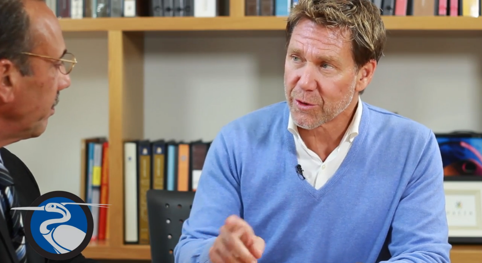


I am Tom Iovenetti with Benutech Incorporated, makers of ReboCollaboration and ReboGateway, tools. These are systems for real estate professionals, bringing you this ReboReport today to further your education and give you insight as to what goes on in a lot of critical aspects of real estate, including branding.
So today we’re going to talk about real estate branding, something that I think a lot of you have tried to do, maybe attempted it one way or another, to incorporate in your advertisement. But maybe you want to talk and listen to a professional tell you some other critical things that you need to know about real estate branding, so today I’m here with David Riley with David Riley and Associates. I’ve done business with David in the past and capacity of Coldwell Banker and other companies that I’ve worked with, and I have to tell you he is brilliant and we’ve been able to do some really great things that today are still intact, still working on the national level. Today I’d like to introduce to you David Riley.
David, thank you so much for coming today and allowing us to visit your office and talk about real estate branding. Today we’re going to ask some questions to David, kinda give you an insight. The first question that I have here: what would you consider to be the most important item in establishing a brand identity?
Personal brand or a corporation?
Well, let’s start with a personal brand.
In both categories I would say having a integrated branding program, continuity, a brand that is consistent from the business card all the way to their documents, to their brochures, as well as even to their website. So everything is clean, concise and recognizable to that brand or to that organization.
Now we’re talking about branding. Let’s be more specific about that. Most of the real estate professionals out there try to establish themselves as a name. When talking about their names, would you consider making it into a logo? Or would you consider them keeping it real clean and just using their name in context of whatever franchise they’re with? What would be the best way that they can use their name?
It depends on the individuals name. Usually if it’s going to be very recognizable. So you wanna make it short, concise, something that is going to be memorable to the viewer and to your audience. And then iconically, if you can bring an icon into your brand, it’s also gonna be much more memorable, especially as the see their ads in their brochures. We want to make it something that is recognizable by the viewer and memorable to the viewer.
So if they’re working in a franchise organization and they’re sub-branding themselves, I guess you would call it, would that be overpowering the the franchise brand? Or would you consider that just an identity to them themselves?
It’s an identity to themselves. However the identity of the organization still should be very dominant, if they’re with a certain big name organization. Hopefully that organization is well branded as well and they’re not competing against each other, they’re just building a brand within themselves with that organization, if that makes sense.
Some of the agents make a lot of mistakes.
Yes, I’ve seen a lot of them.
You’ve seen a lot of mistakes, I’m sure. Some in the way that they have certain, they have one brand for themselves yet they don’t follow it through on everything that they do. Is that a big mistake in the industry, by not being able to stay consistent with everything you do, from, let’s say, business cards, signs, open house signs, letterhead, stationery. If they’re not utilizing everything in their branding, is that a mistake?
Yes a huge mistake. As well as branding with an organization, trying to come off that brand and be consistent with that organization I think is a huge plus. Oftentimes we see different agents trying to create their own brands away from that organization, and there’s a conflict as well. The conflict is not only in the design, but also something within the brand that they see – that looks like, well, is it with XYZ organization or is it with themselves? So I would usually recommend trying to have a brand that actually plays off the main organization’s brand, without doing something totally different or coming up with a different color palette.
Yeah, those different color palettes probably would would be conflicting.
Absolutely.
Now in the past, I recall, when we work together you provided us with a brand book. And it gave everything from front to back, total, including advertising. What I’ve seen is, and I’m sure you have recognized this as well, most new agents out there watching this have probably done this, tried to create certain segments of things and do not stay consistent. Can you explain how a brand book works? And if they were to call you to inquire about how to create a brand, what you would be doing for them for that consistency?
We create these graphic guidelines after we’ve created the look and the feel of the organization – or the individual – and the graphic guidelines gives them the tools – often we will call it the Bible of the brand. What to do, what not to do, as far as placement of the logo, usage of logos in color and black and white, and then what we refer to as the real estate around the icon or the logo itself. And then making sure it’s an integrated branding program. So you see a business card all the way to a brochure or an ad, everything is consistent. The typeface is consistent, the size of the typeface, the color palette, and even the final execution and paper stocks is extremely important to a brand.
So everything, from front to back, is consistent – the typeface, font, all the way to the website.
All the way to the website.
And you do create website as well.
We do.
So in the branding it’s important that you understand that it also includes the websites. Now, one other question that I have for you: when they’re through creating their brand identity, how would the consumer view that? What are you trying do when you’re reaching your branding to the consumer? What kind of reaction are you trying get? Long-lasting or however that works?
Well, you have a small window. I bring up companies such as Nike and Apple. These are brands that we all remember. The beauty of Apple, everything is very clean and concise. Everything from the product to the packaging, to the in-store experience, as well as to the website. That’s what we try to emulate with our clients, something that is clean, concise and, again, that integrated program throughout that everything matches, from the card all the way to the experience, and even for the individual. But what you want to be able to portray to the consumer is something that is professional and that you have everything together. Everything is current, clean, concise in its overall brand. People look at the print material as well as the website, then they’re gonna look at you and say “Gosh. This organization, this company, this individual has their act together, and they’re going to be great to do business with as well as to be able to, given the opportunity, that this is a company that I want to go work with.
And so I remember something very important when we were talking about branding, and that was that you really liked a lot of white.
White space is important.
Explain why white space is so important, because I know real estate agents out there are going to say you want to use every square inch of the piece of paper you can… But I’m gonna tell you, I’ve learned this through David and his company, it’s very important that you don’t fill in every inch. And why?
Absolutely. The biggest reason is that you wanna be able to identify the hierarchy of a layout. Let’s say you’re looking at an ad or even a website, you want to be able to have a hierarchy from the headlines to the subheads to the body copy, and then have, again, real estate or an area around it in white space to give area for a breather, or a place for the eye to rest. Often times we see these ads, you don’t even know where to look on an ad, it is just so convoluted either with logos, headlines, and you don’t even know where to start or even to finish. So in our layouts we want to be able to create something that is clean, concise, white space – breathing room for the viewer – as well as be able to understand in that hierarchy of type.
So would you consider pictures on a business card a brand?
It can be, but we’ve seen a lot of bad photographs of, especially, agents, and them taking pictures with dogs or their family members, and we usually try to steer our clients away from that.
It’s been something that started in the real estate industry years and years ago, where it was a way for real estate agents to separate themselves individually by allowing the consumer, whoever has their card, to recognize who they were. However, as we start to see changes in the industry, it’s evident that you can do better with less than having your picture on there, and plus you have to change the picture often, have to keep updated with who you are.
Another thing I’d like to talk about is the advertising aspect – in the ads real estate professionals or agents tend to use, and I’ve seen this a lot,
a lot of type. What would you consider, what would be the best way for a real estate agent to advertise not only themselves but their properties in a way that doesn’t take up a lot of words? What I’m trying to lead to is, is it better to have fewer words than it is to have a lot of words in identifying the property and yourself?
Fewer words. In this day in age, you can look at the advertisements, both in television and print, Everything is short and concise. People just don’t have the time and want to read, or take the time to read, a lot of copy, so you want to make it short, concise, and hopefully creative and memorable. And that’s what you want them to finally take away from the experience.
In real estate, what would you say were the most important points, as far as were are the bedrooms important, or is the price the most important? Is the picture that you’re taking the most important?
Photographs. Number one. I see a lot of bad photographs out there, and it’s worth investing in a good photographer as well as a good photograph of the
property. Then it would be a price, bedrooms, square footage, but short and concise without having to write a lot a copy about the property itself. The whole idea is to get people that are interested in the property to make that phone call or go to your website.
Would you consider having testimonials in your branding book?
Yes, but again I’d keep it short and concise. Usually one or two sentences at the most.
Pictures of the people that are doing the testimonials?
That would be great, but also don’t don’t leave them for a long period of time.
So you’re constantly changing them?
Constantly changing. Get new testimonials so people aren’t seeing the same thing over and over again. And all of a sudden they see your ad maybe three to four months later and thinking, well, they’re using the same testimonial, can’t they even get any new ones?
Social media.
Huge.
Huge today. Would you consider all the aspects of social media in branding?
Yes. However, again, it’s going to be hitting a different demographic. You have also have a younger generation now coming up that uses social media, and it’s becoming more and more popular. Especially Facebook. Any way that you can constantly communicate to your clients or potential clients is great for business.
That’s interesting, because if you look back at the average age of the realtor today on the national level, they say it’s just over 45. And I think the the age group for social media is probably in in the mid-thirties, that is more actively pursuing that than somebody in the real estate industry. But how would you use the social media aspect of this? You want to separate what goes on in your private life, what goes on your business. Facebook being kind of an open book, would you consider Facebook being a way of connecting with these people? Or would you limit the amount of branding you would do in your Facebook?
I would limit it. Again there’s the personal level and the business level. Again, your audience that’s going to be on Facebook is probably going to be a younger audience, but it is growing. More and more people are now getting into the Facebook realm. They want to be able to have that communication of what’s going on in the real estate business. So personally I would try to separate the personal level from the business level. People don’t really care about where you took your last vacation.
So from what we’ve talked about, the most important aspects would be photography. Recapping that, better use of white space, consistency in all aspects of your advertising and your your branding with regard to your typeface and font, colorization. Suggestions not put a picture on a business card, and not to have conflicting colors that run into other brands.
And I would say this: if you are going to use your photograph make sure its current that’s. That’s the other thing that we see, that agents are using photographs that they’ve had maybe thirty years ago. So update the photograph, make sure that it’s current and that it’s well done. And I also recommend black and white photography versus color. Black and white is much more forgiving, and the black and white makes it a second read then a first read. So again it should be really about the brand, not so much the photograph or the individual.
That’s great advice on the black and white. I can remember the black-and-white photographs being a little bit more forgiving. And in this day in age we’re trying to find all the forgiveness we can. So before we leave, tell us a little bit about David Riley and Associates, and how long you’ve been in business, and how you came to be in this type of industry.
Well, we’ve been in business for over 28 years. I’ve been fortunate to, prior to that, work for Disney for eight years. Disney organization in Anaheim, work in the parks and resorts. Left them 28 years ago and started DRA. I was fortunate enough to have Disneyland being one of my first clients as we started the company. We’ve done branding for companies such as Disney, Universal Studios, Paramount, and a number of real estate companies here in Southern California and across the US.
You kinda got immersed in the real estate area. A separate request by an individual at one time, and it kind of pulled you in, didn’t it.
Yes and we’ve done a lot of development projects both here in the US as well as in Mexico and Hawaii.
So you’re familiar with the new homes projects and development, how to put together presentation booklets and and things of that nature as well. So if somebody want to get ahold of you, what would be the best way to get ahold of you, like your website address.
Our website is RileyDRA dot com, and our phone number is 949 760 6901. We’re located here in Newport Beach California.
That’s fantastic. I really appreciate you coming today and talking to us about branding. I hope this helped you in deciding how you’re going to brand yourself in the future. I strongly suggest, if you have any idea at all on how to do this, call David Riley & Associates. I can’t tell you how beneficial it’s
been to me in my career and what we’ve done not only on the corporate side but individually. And I want to thank you again so much for talking with us today. This is Tom Iovenitti, at Benutech Incorporated bringing you this ReboReport, and go on in the future, be brilliant. Thanks for watching.